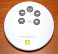
I recently purchased a naviPod remote for my iPod, because I use my iPod every day at work. Because of the layout of my office, there isn’t a convenient place to put the ipod and control it. I used the Apple supplied corded remote for a while, but then when I took my iPod somewhere else, I had to untangle even more cords. I love having a remote, but I do have some issues with the design of the remote…
 |
Its nice that the remote looks like something that should attach to my iPod. And, sure, it is very iPod-y. But it also looks a lot like the standard Apple 1 button round mouse, that a lot of people don’t like.
But the real problem comes because the remote is round. Not only is it round, but the bottom is curved. The only flat spot on the remote is the top, where the buttons are. The buttons are well placed, and they are a good size. The remote itself is not a bad width, and the curved bottom makes it pretty comfortable in your hand. |
|
|
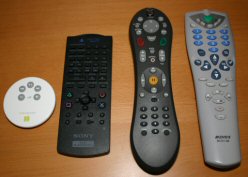
The problem comes when you try to pick up the remote. As you can see to the left, almost every remote in the history of the world is rectangular. Some of the better ones nowadays are contoured in some way, so that they fit naturally in your hand. There’s a reason for that rectangular shape. When you set it down, you can just pick it back up. You might pick it up upside-down, but thats the only wrong way to pick it up. The naviPod is round. Perfectly circular, round. See where i’m going with this? When you pick it up, there are 359° of wrongness! Not only is the naviPod round, but remember that i said the bottom is curved? The bottom of every other remote in the world is flat. Do you know why? So that when you set it down, it stays where you put it. If you’ve ever used a TiVo remote, you’ll see that it has curved edges, but there are flat spots on the bottom. Even if you set the TiVo remote down on its side, it ends up right side up, sitting on the flat spots. Not so with the naviPod! If you set the naviPod down at even a tiny angle, it rocks like a weeble wobble! And while it is wobbling, it spins! So when you go back to pick it up, its now laying in a totally different place at a different angle! To see it in action, watch me set the remote down on my desk. In the video i’m not spinning it, i simply set it down. If it is sitting on the desk, you can press down on any edge and let up, and it will do the same wobbly spinning move. So now when you pick it up, you have to look at it, and probably have to use the other hand to rotate the remote in your hand so that you can press the buttons. What could they do to make it better? One of two things.
So from me, the remote gets a 75% review. It does its job, but could do it better! I might take the remote apart and mount the buttons and circuitry inside of another remote, or sand down the bottom so that it doesn’t wobble. |
 |
|
